Why Hair Colour Looks Different in Reference Photos
You save an ash-brown hairstyle on your phone, then notice it looks golden on another screen. A second photograph of the same hairstyle seems darker again. This does not make reference pictures useless. It means the picture is a conversation tool, and the details you point out are more reliable than a colour name or a single patch of pixels.
Look at the whole photograph before judging the shade
Start with the light. Is the person beside a window, outdoors in direct sun or under warm indoor lighting? Bright reflections can make sections appear lighter, while areas underneath the hair look deeper. Camera exposure, editing and your screen settings can also change the appearance of a photograph.
There is rarely enough information in one image to identify the exact colour in real life. Avoid treating the lightest reflection as the shade of every strand. Instead, look at the roots, the mid-lengths and the shaded underside. Together they give a better sense of the colour’s overall depth and contrast.
Separate four things you might be admiring
- Depth: how light or dark the overall hairstyle appears.
- Tone: whether you are drawn to a warmer, cooler or more neutral impression.
- Placement: where lighter and darker areas sit, particularly around the face and parting.
- Finish: whether the shine, curls or smoothness are doing much of the visual work.
You may love the soft ribbons in a photograph while disliking how light the ends are. You may want its darker roots without its bright face frame. Say that explicitly. It helps your stylist preserve the part you like instead of interpreting the image as an all-or-nothing request.
Compare like with like
A heavily waved hairstyle often reveals alternating surfaces and shadows. Straight hair presents the placement differently. If you usually wear your hair straight, find at least one straight-hair example alongside your favourite curled photograph. Likewise, seek a similar starting depth and length when possible, while understanding that your own hair history still matters.
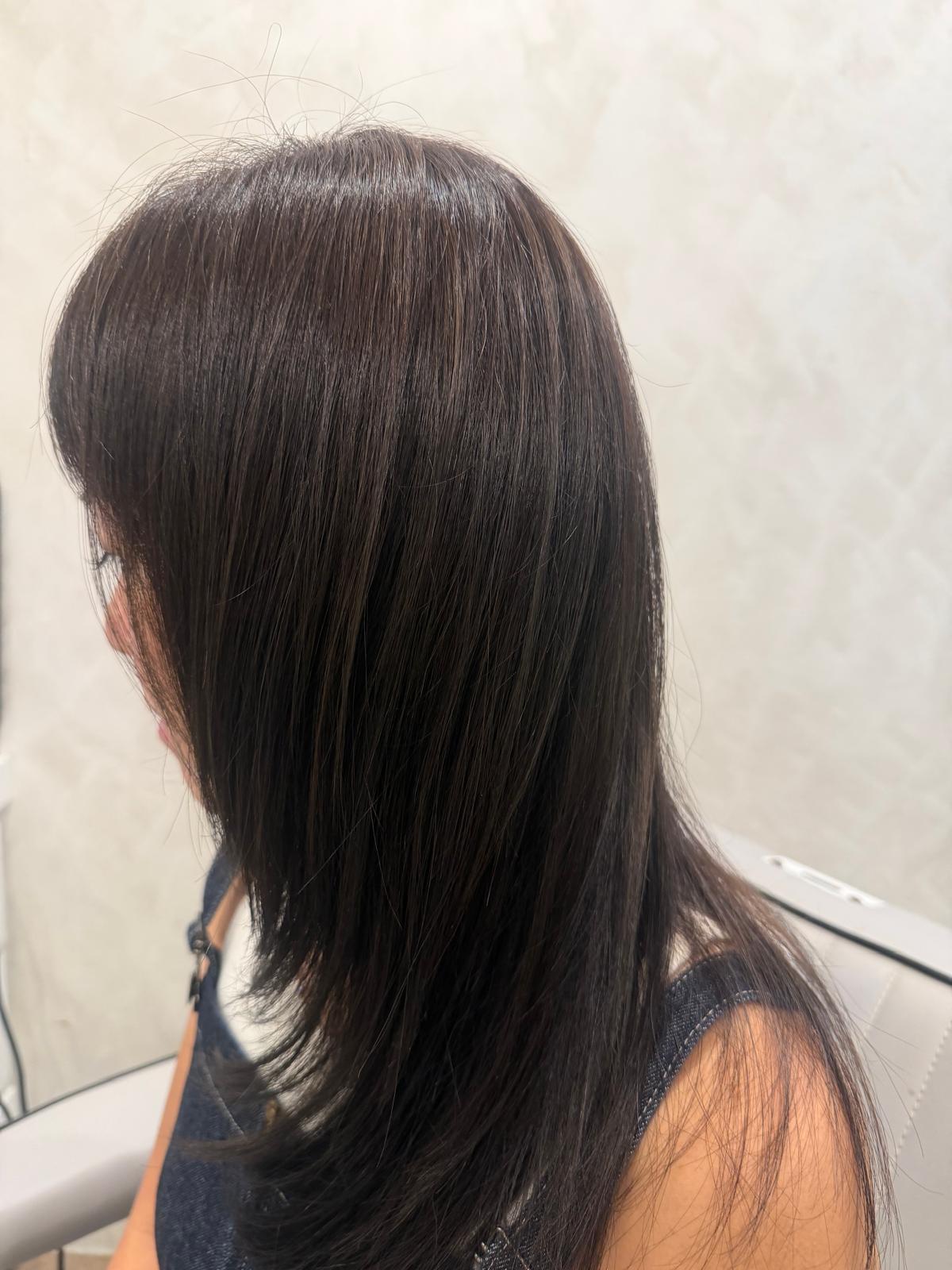
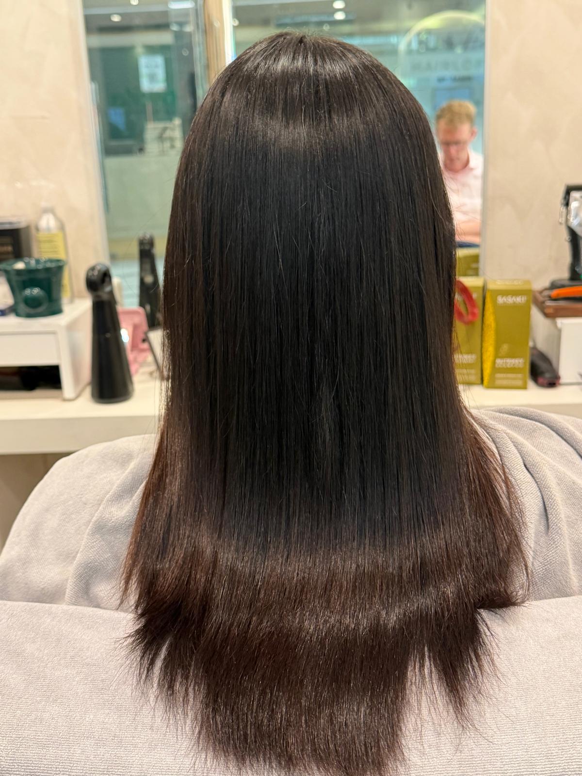
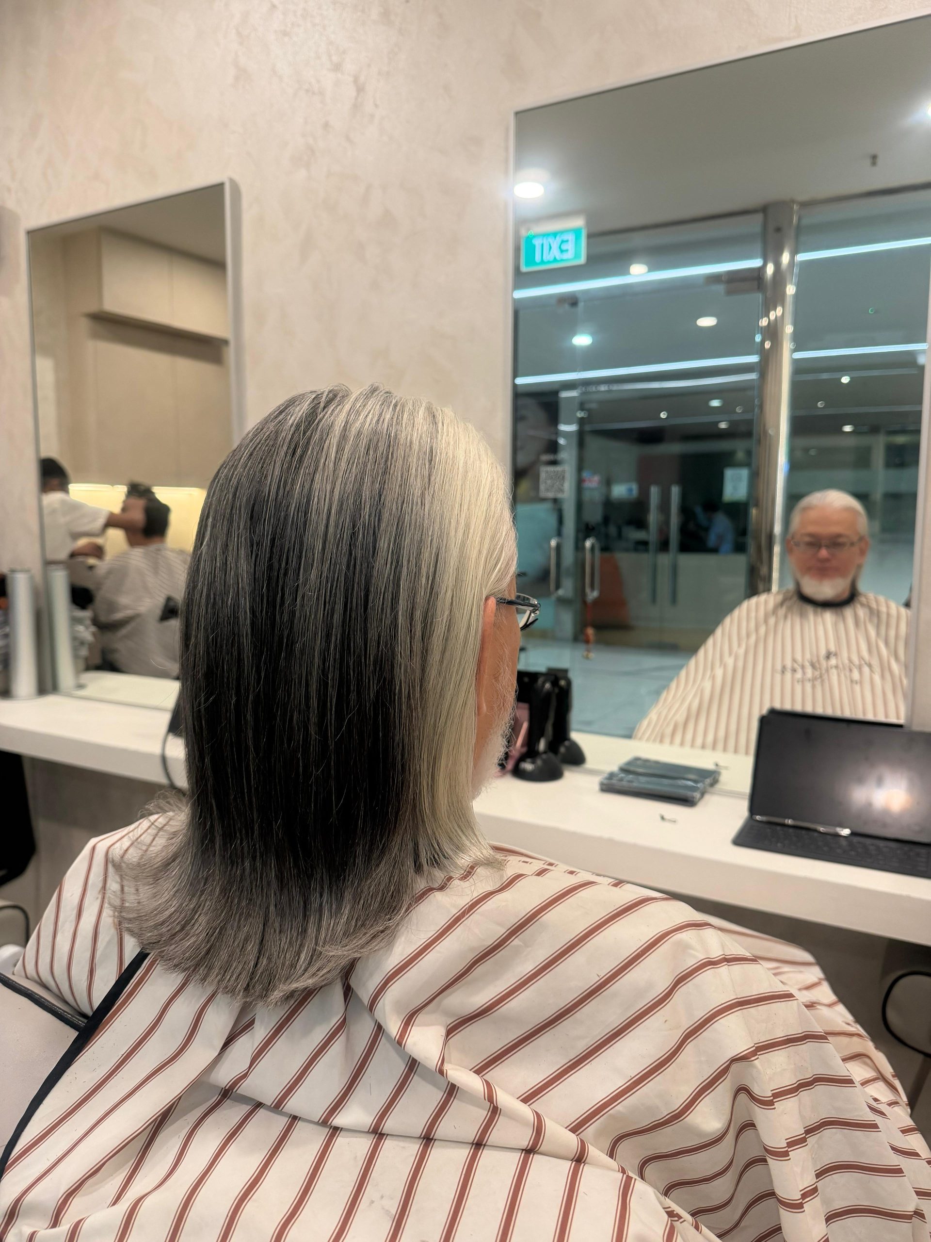
Look for several views of one hairstyle rather than collecting twenty unrelated finishes. A front view explains the framing; a back view shows how lightness is distributed; a side view can reveal the transition near the roots. If all you have is one picture, acknowledge the missing views instead of filling them in with assumptions.
Use a three-photo reference set
A compact set can be more useful than a long camera roll. Choose one photograph for the overall depth, one for the placement you like and one that shows a feature you want to avoid. Add a short note to each. For example: “This overall brown, these fine pieces around the face, but not this much contrast at the ends.”
Take current photographs of your own hair in even light, without filters. Include the roots and ends, and explain when they were taken. A recent haircut or colour service can make an old current-hair photograph misleading even when you have not edited it.
Ask the stylist to translate the picture into a plan
Useful questions include which part of the reference is realistic for your current hair, what would look different when you wear it unstyled and whether the preferred tone would require ongoing attention. Ask to clarify the intended depth and placement before discussing a trend name. Hairloft’s hair colour services outline the categories that can form part of that discussion.
The salon page also gives context if a cut or style change is part of the image you like. To prepare for a visit, send Hairloft your reference set and current photographs. The aim is a shared description of the result, with room for an honest assessment of your hair, rather than an exact reproduction of a screen.